Akin
CONTEXT
Akin is a hair product for professionals seeking a polished look. Unlike oil-based competitors, Akin rinses out completely with no extra shampoo needed.
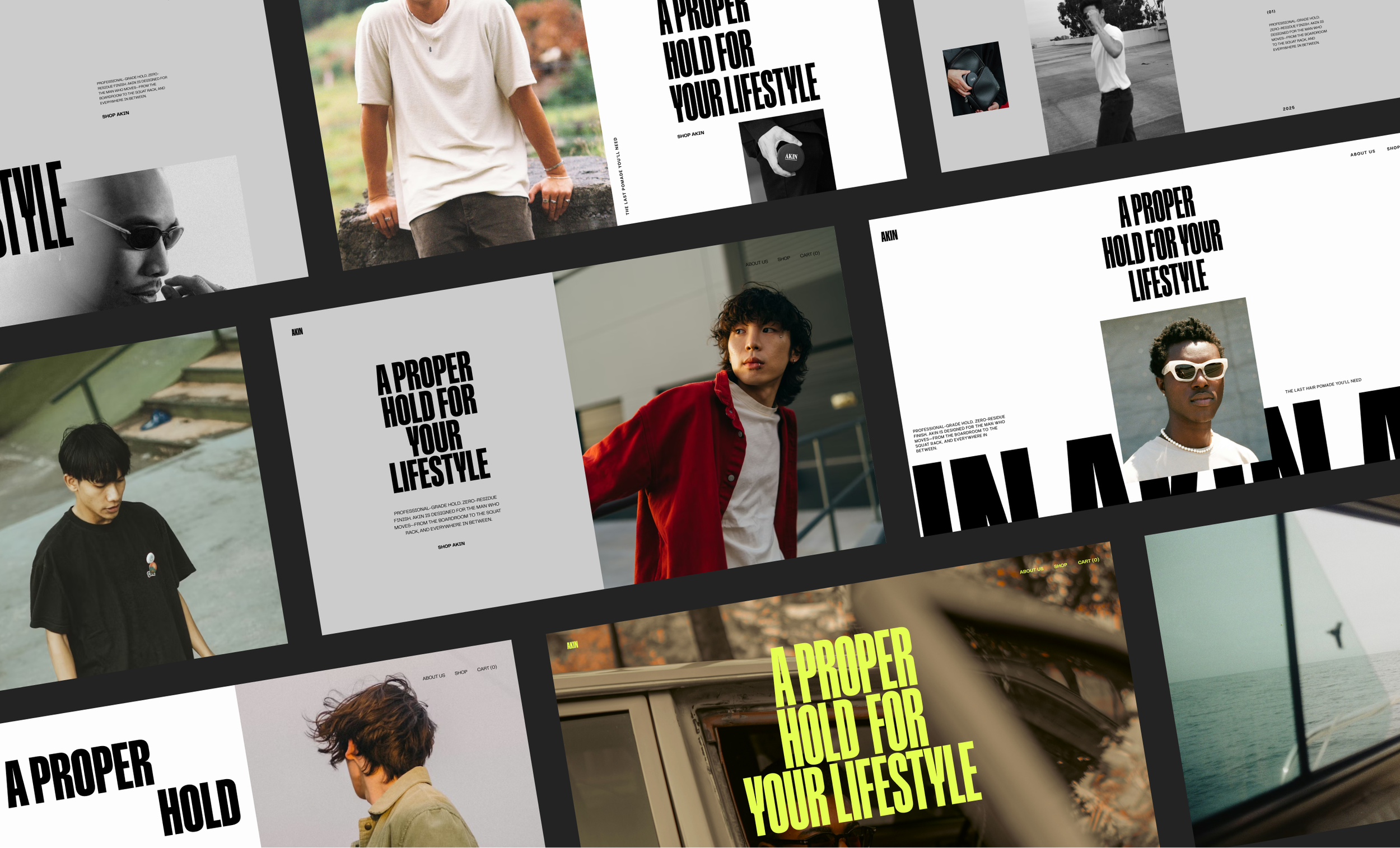
My goal was to give the site a modern, editorial feel—more like a brand story than a typical e-commerce site. To bring that to life, I leaned into a lifestyle focused art direction and condensed, bold typography.
CLIENT
Akin
ROLE
Product Design · Art Direction
Homepage
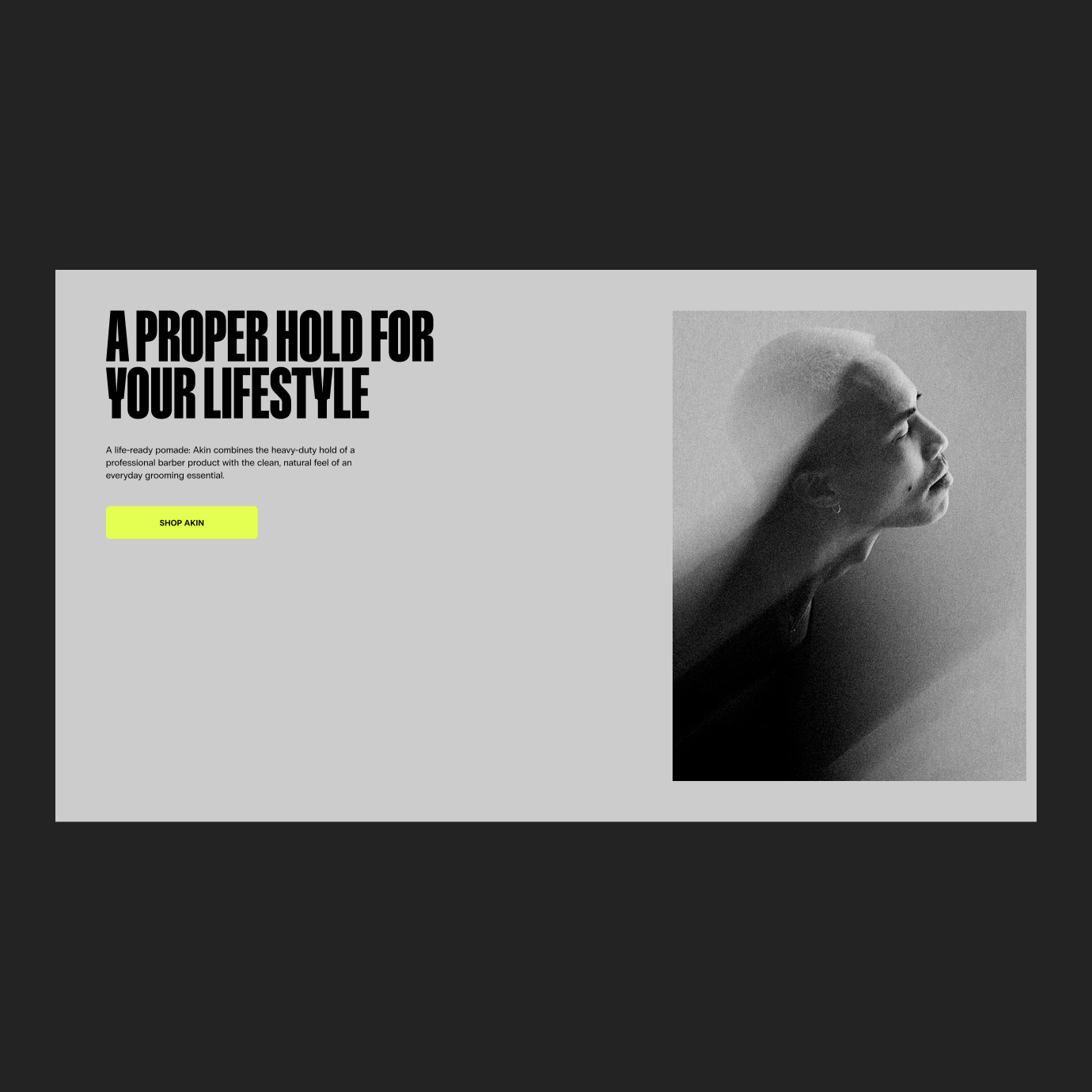
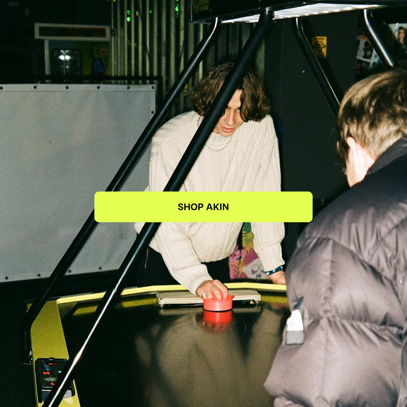
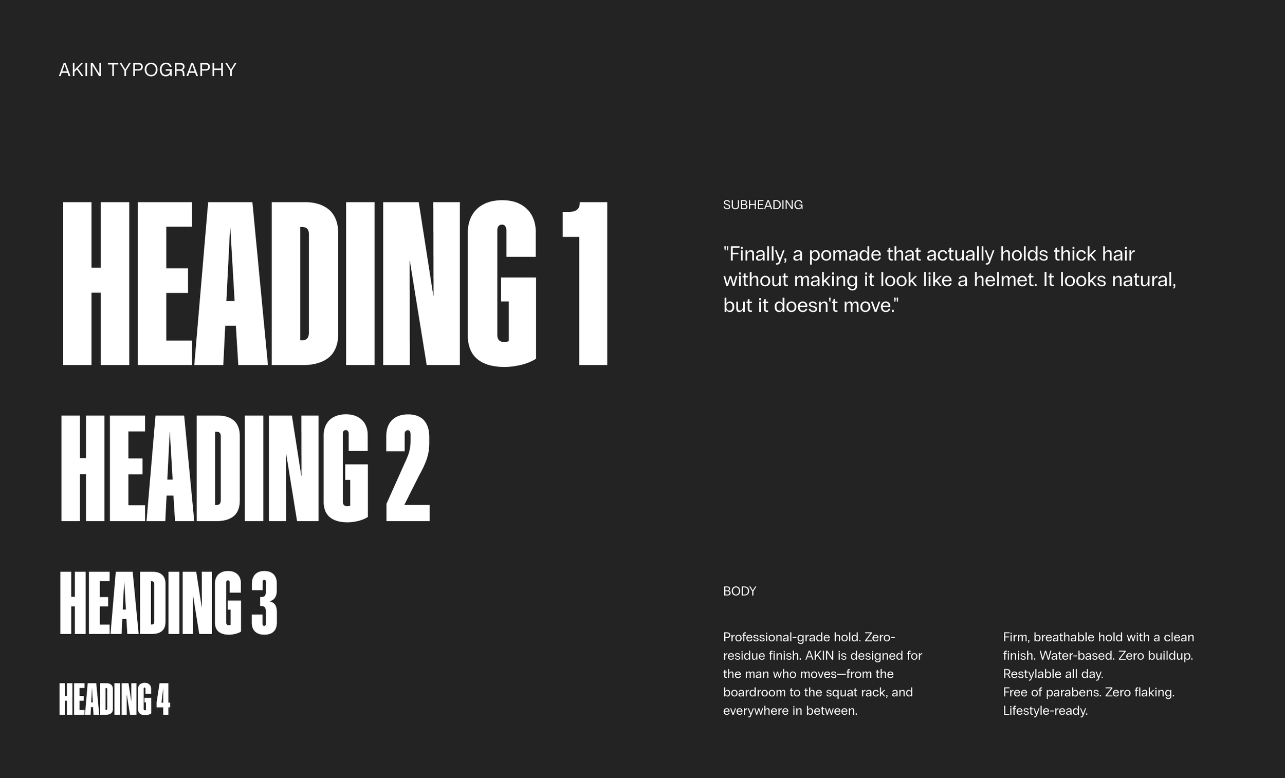
BOLD AND CONDENSED
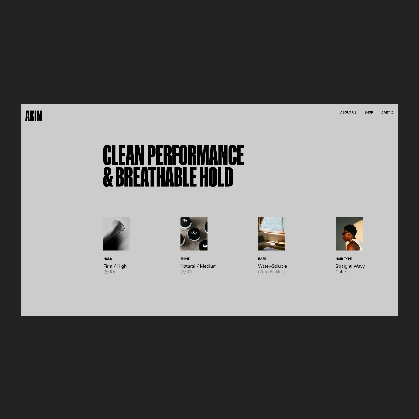
For the homepage, I focused on creating a strong, immediate impression that communicates both the brand and product value. Bold typography and lifestyle imagery highlight Akin’s clean performance and breathable hold, while reinforcing what sets it apart from traditional pomades. Clear, intentional CTAs guide users to the product detail page, keeping the experience focused on conversion.
Responsive Designs
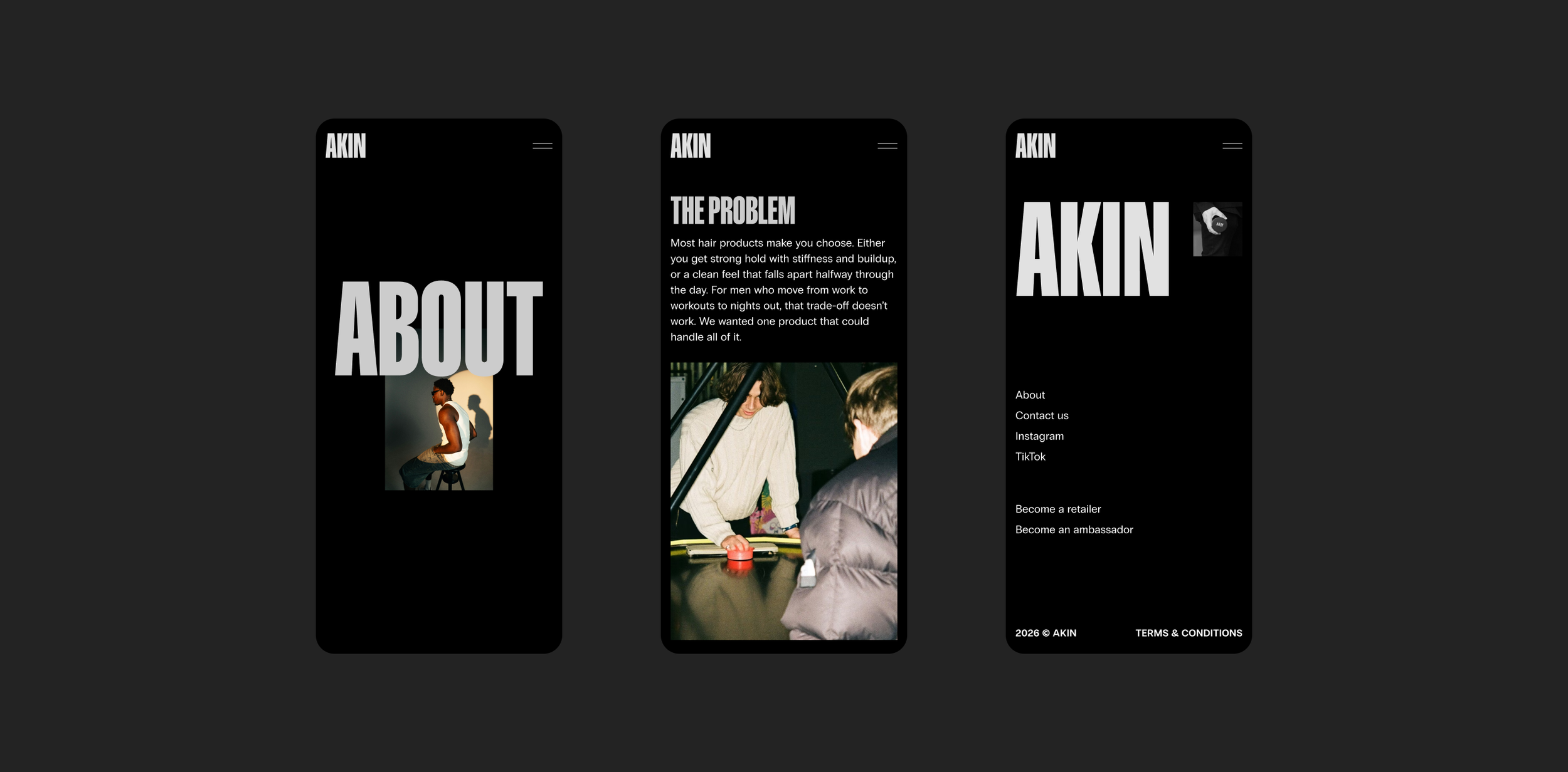
MOBILE
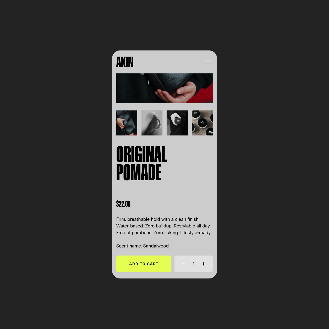
For mobile, I designed the experience to be clean, focused, and easy to navigate. Content is stacked and simplified for smaller screens, with bold typography and imagery maintaining the same visual impact as desktop. Key information is prioritized, and the layout reduces friction while creating a seamless experience that supports quick browsing and conversion on the go.
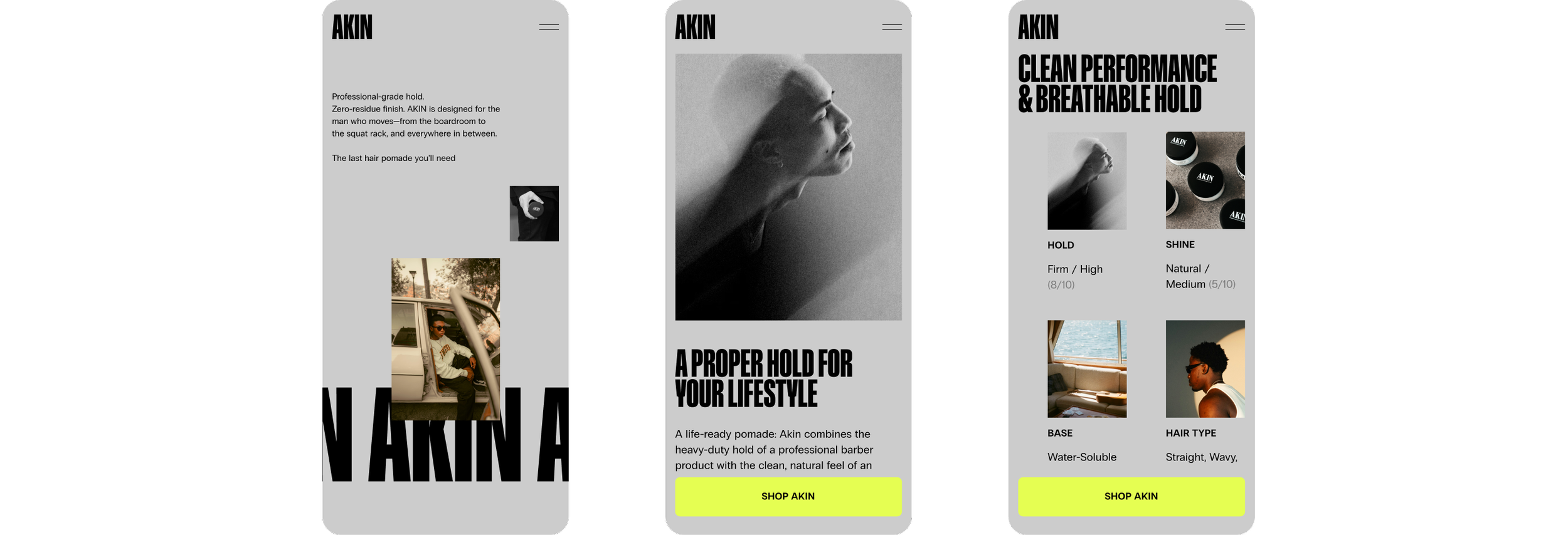
STICKY CTA BUTTON
Because Akin currently sells a single product, I simplified the mobile experience by using one persistent call-to-action. Instead of placing multiple buttons throughout the page, a sticky “Shop Akin” button remains fixed at the bottom of the screen as users scroll.
This keeps the purchase action constantly accessible without interrupting the browsing experience, supporting a more seamless path to conversion. It reduces decision friction and aligns with the brand’s focused product offering, making it easy for users to move from discovery to purchase at any point on the page.
Product Detail Page
CONVERSION DRIVEN EXPERIENCE
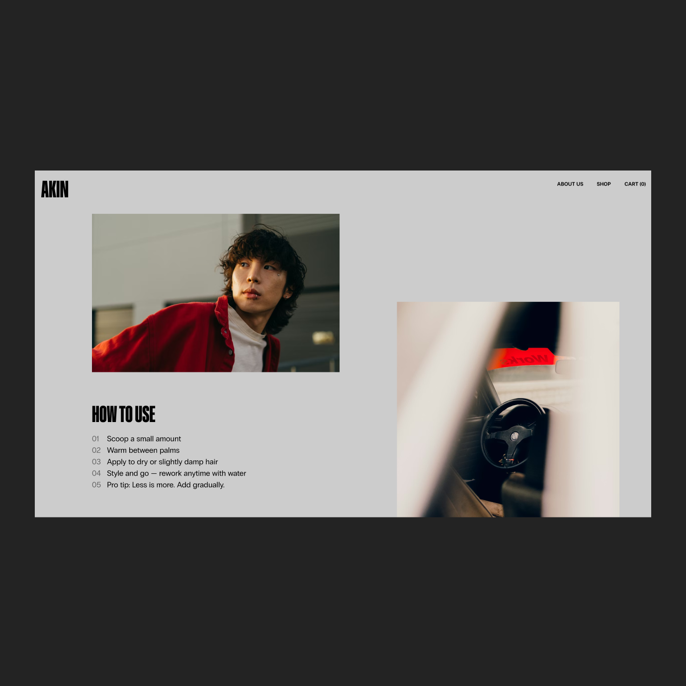
For the product detail page, I focused on balancing strong visual impact with clear, conversion-driven information. The layout prioritizes the product immediately, with a large hero image, clear pricing, and a prominent “Add to Cart” CTA to reduce friction. I highlighted key benefits like clean performance and breathable hold through a simple, scannable structure, while supporting it with product specs and a “how to use” section.
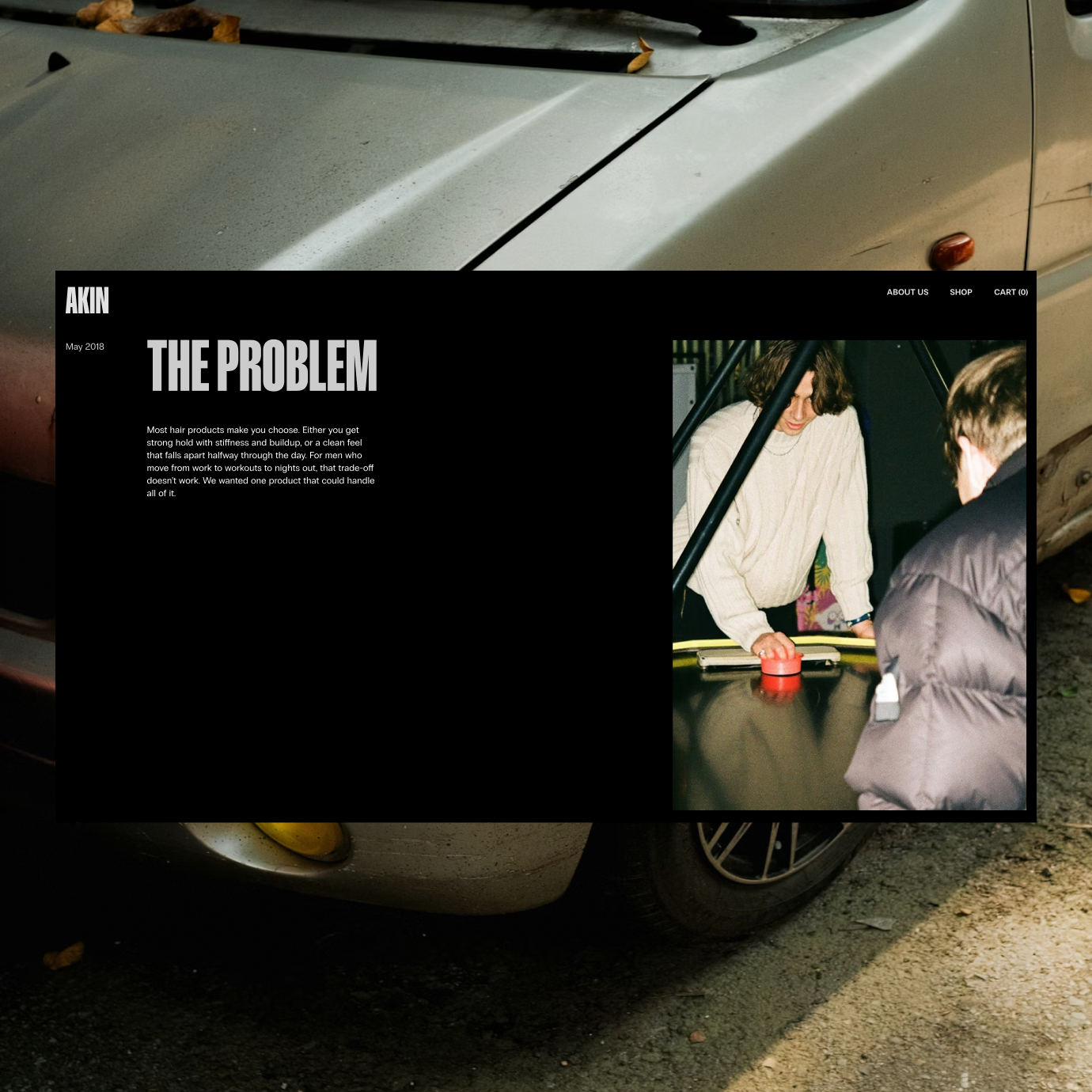
About Page
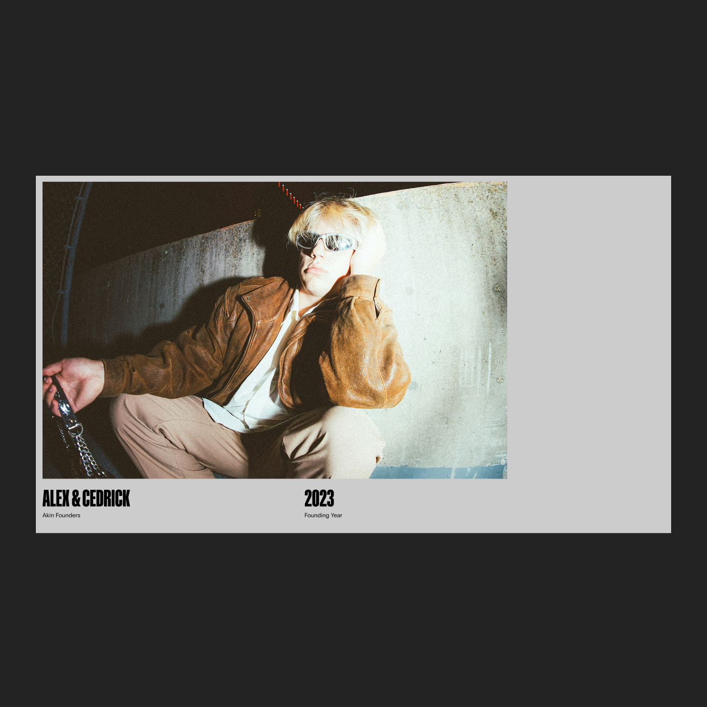
THE BRAND STORY
For the about page, I focused on telling the brand story in a clear, structured way while keeping the experience minimal and engaging. I broke the content into key sections: problem, research, solution, and production, and paired concise copy with editorial-style imagery. The layout alternates between text and image to create a natural flow, making it easy to scan while reinforcing Akin’s clean, modern, lifestyle-driven identity.
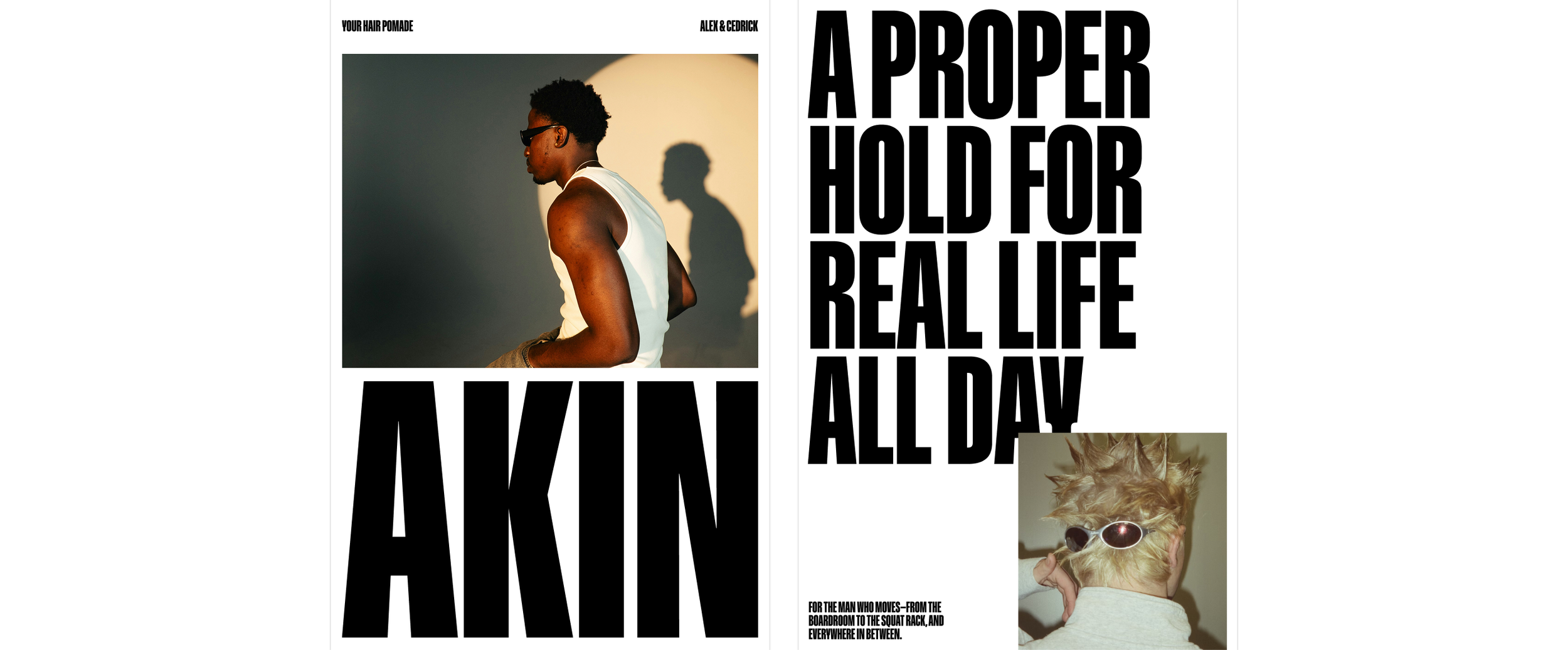
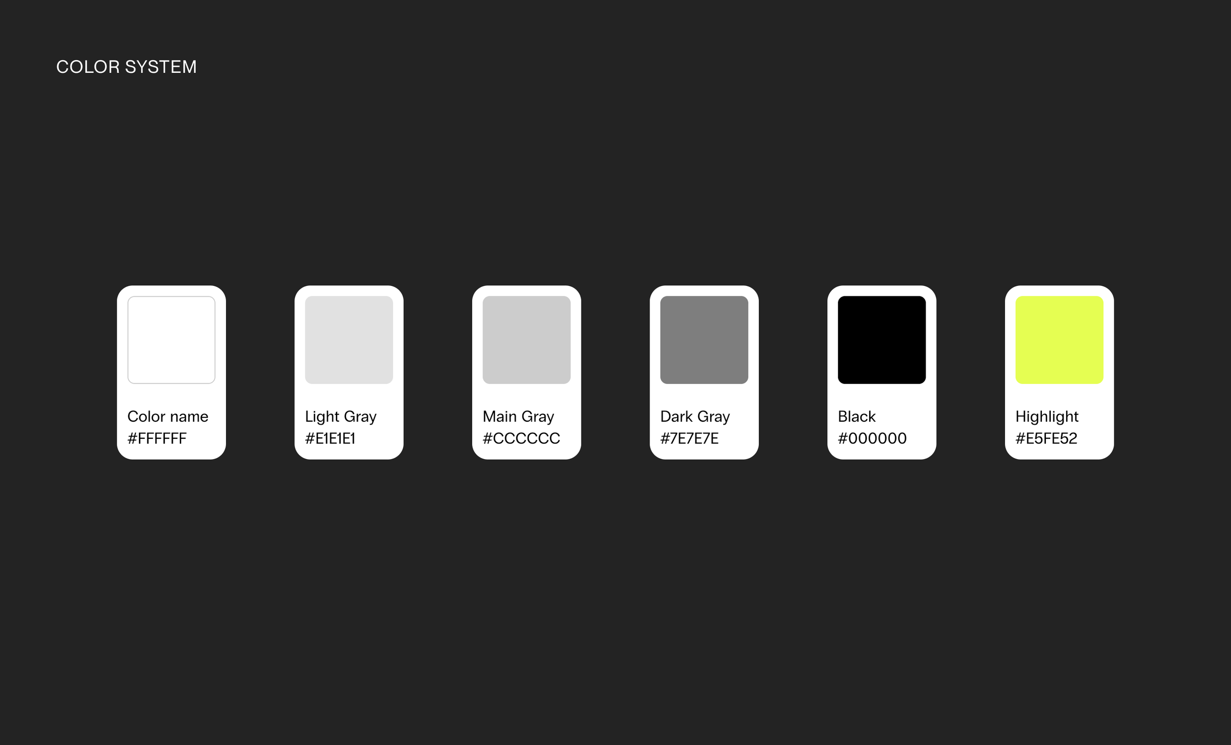
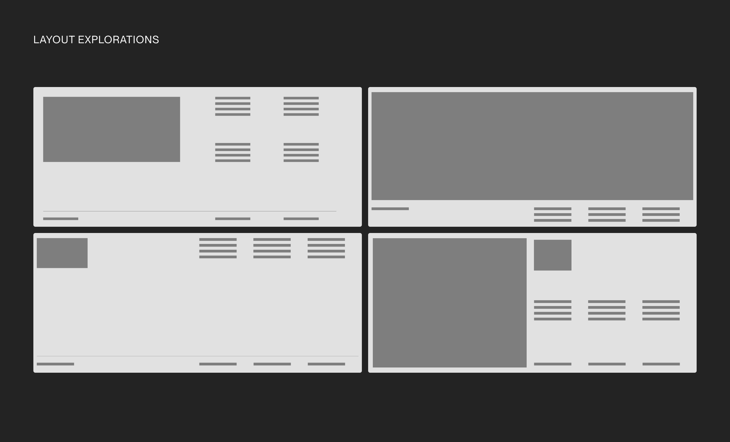
During early explorations, I focused on defining the visual direction through hero layouts, typography, and overall composition. I experimented with bold, editorial-style type, high-contrast color palettes, and different layout systems to find the right balance between brand expression and usability.
PREVIOUS EXPLORATIONS
Direction & Visual Language


Next project
NeuroFlow Sleep Tracker